NYC Food Cart Redesign
Team
Solo project
Role
Brand identity
Packaging design
Social media
Duration
4 weeks
Dec – Nav 2019
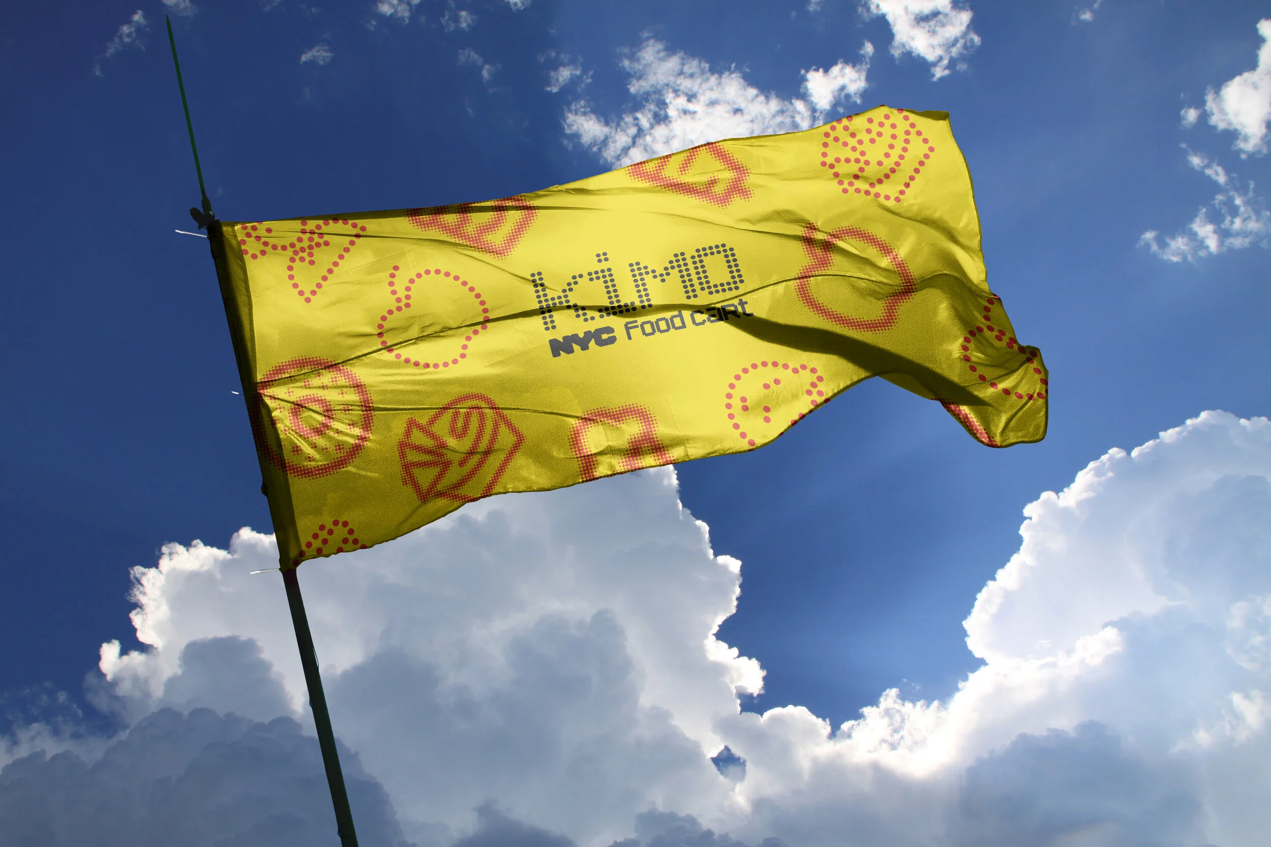
This is a rebranding project for the whole of New York City’s food carts. These carts' location dots are very crowded on the map and it becomes the concept. Dots can represent a lot, such as location, community and diversity, which are suitable for NYC.
For large scale printing.
For small scale printing.

The NYC Taxi's NYC logo is added as it's been a symbolic mark of this city. It's a way to keep the consistency as well.

The color palette is from the rainbow which shows diversity. And it’s good to prepare for the pride week every year in NYC.
There are three iconography systems for this project for different situations. The first one is only for large scale printing.
The second, a line version usually works for small scale printing, while the last single dot line system will be used for the smallest printing.
These multiple systems provide the options for the cart owners to customize their brand to show their own personalities.
Let’s take a cart named "Kimo" as an example.


