Musimount
Team
2 Designers
We worked closely with another designer to handle the entire project.
Role
Desk research
Brand identity
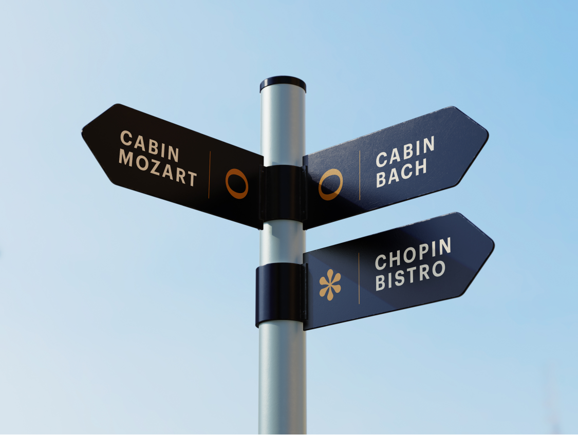
Environmental graphics
UI/UX design
Web design
Prototyping
Duration
9 weeks
Oct – Dec 2020
This is a music festival made from scratch by our team.
Musimount is a holistic musical experience showcasing leading classical music artists of our time, and magnified by the natural beauty of the winter mountains. It is a holiday away from routine life, and at the same time, a celebration of classical music.
The name is composed of the slogan “Viva la musica” and the location, a snowy mountain. “Musi” and “Mount” come together to form Musimount.


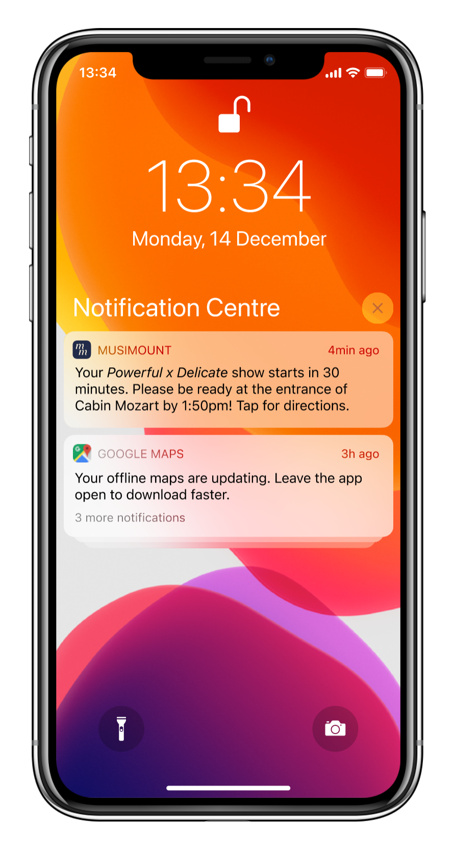
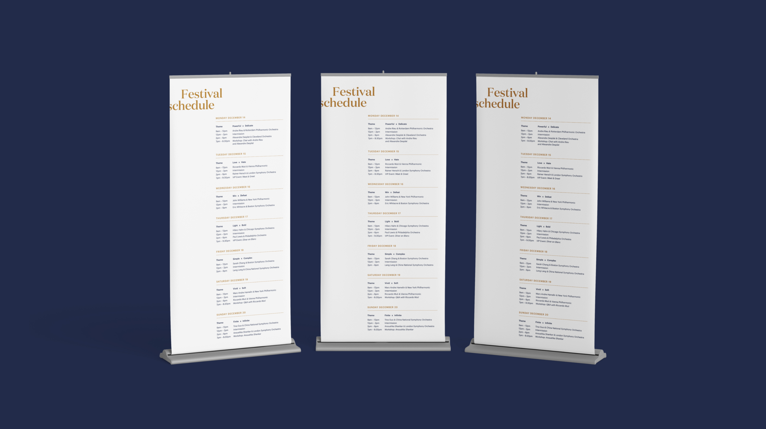
The festival will run for 7 days, and each one represents a music note: Do Re Mi Fa So La Ti. Every day we will have an opposite themed programming with intermission in between. All concerts will be performed by not only well-established but also up-and-coming young performers.

Main teaser poster

Artist teaser poster 1

Artist teaser poster 2

Theme teaser poster 1

Theme teaser poster 2

Concert poster 1

Concert poster 2
Besides the concerts, we also offer other events such as classical music workshops, lectures and talks given by leading artists and young professionals, musical walks in the snow, wellness spa, snow activities, and more. We hope that all these events will bring a real sense of winter holiday with the addition of classical music to our festival-goer.

Activity poster

Workshop poster
Folded events calendar/programme.

Environmental graphics

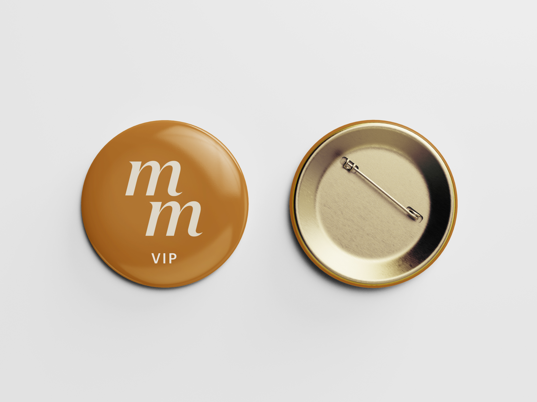
Merchandise


Other applications


Our primary typeface is Domaine Display from Klim Type Foundry. With the elegant, traditional feel of Domaine, we wanted a supporting or secondary typeface that felt modern and contemporary. That is why we chose Graphik as our secondary typeface, which is from Commercial Type. It’s a refreshing neo-grotesque sans serif typeface. Domaine Display has 12 weights while Graphik has 10, and both of them have lots of glyphs so they are easy and flexible for us to work with. Here is a sample of what they might look like in our design collateral.


For the color choice, we were inspired by snow and ice for the beige, musical instruments for gold and mountains for blue. We chose highly saturated colors because we want to have a vivid and active sense for our festival and break the old-school classical music visual stereotype.
To know more about the concept and brand, please check the Brand Guideline.

For the icons, we used four icons inspired by typographic glyphs and musical notes. The asterisk symbol for booking resorts and snow events is also a music note representing when and where the sustain pedal should be depressed. We also use the whole note for all concerts and music events; The whole rest note for apres-music rest activities such as social events, food, fireplace in the cabins. And music workshops will have it’s own sharp pitch symbol.

To provide the best experience to our audience, we designed main and day of websites with a native app.

Main web landing page

Main web menu

Main web schedule page

Main web Apres music page

Main web ticket booking page

Main web store

Main web safety page

Day of web landing page

Day of web landing page scrolling down

Day of web ticket sold out page