Arras Foundation
Team
Solo project
Role
Desk research
Brand identity
Environmental graphics
Duration
3 months
Feb – Apr 2019
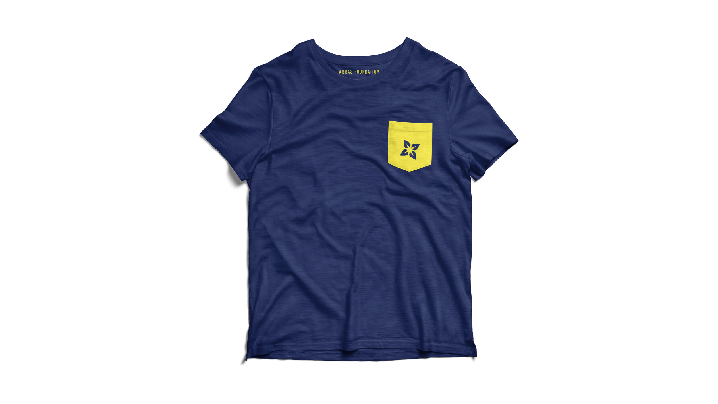
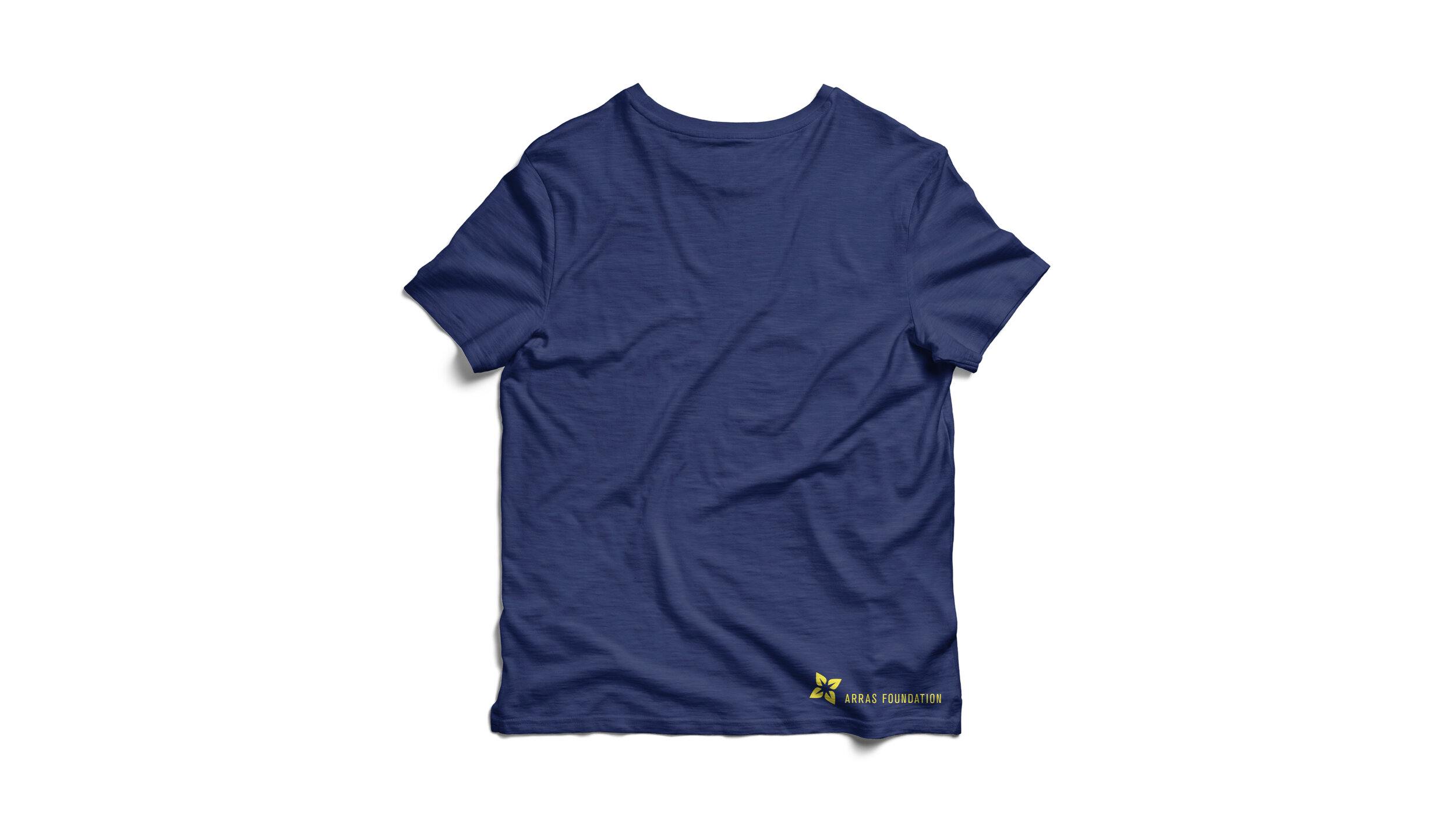
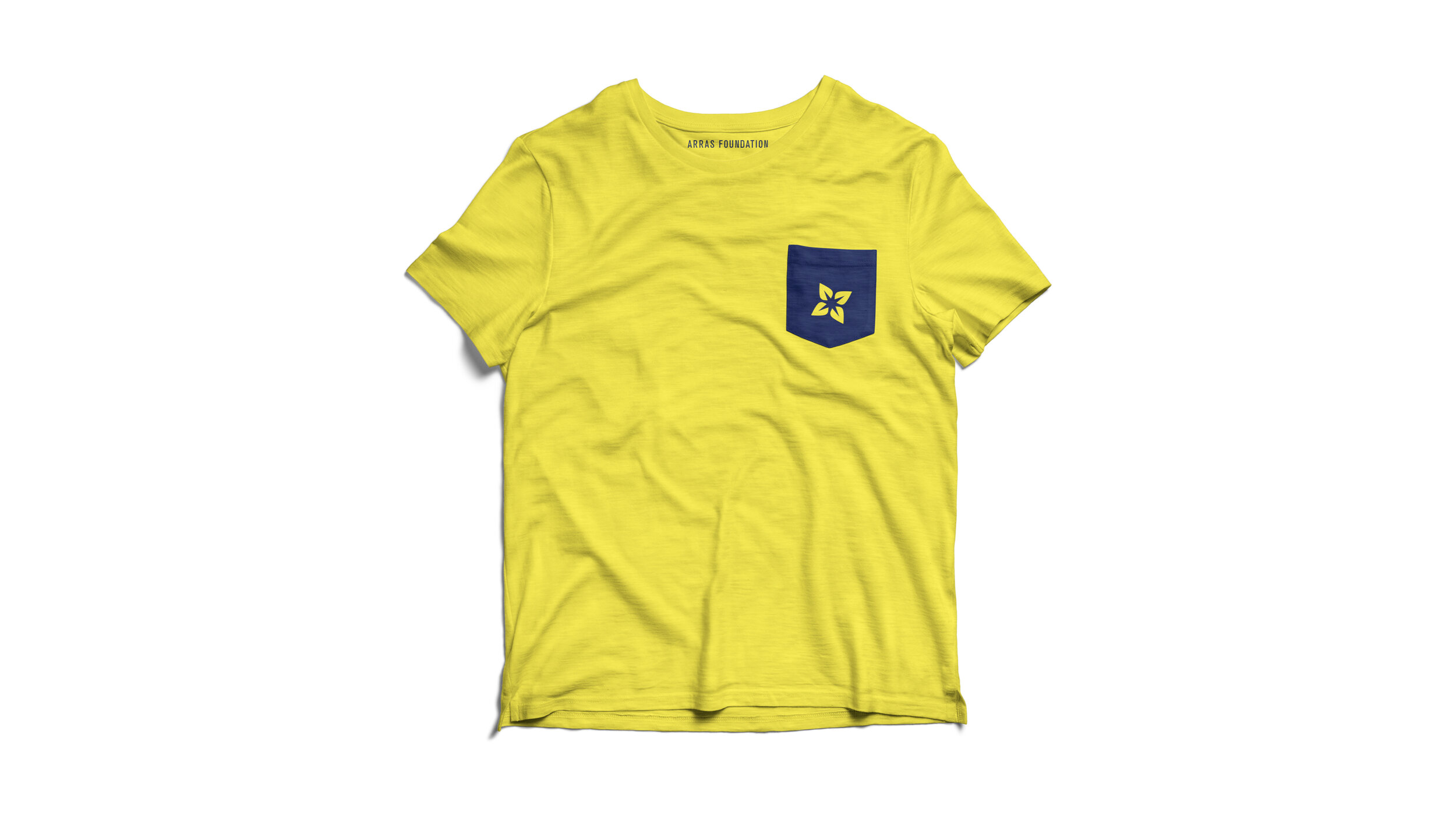
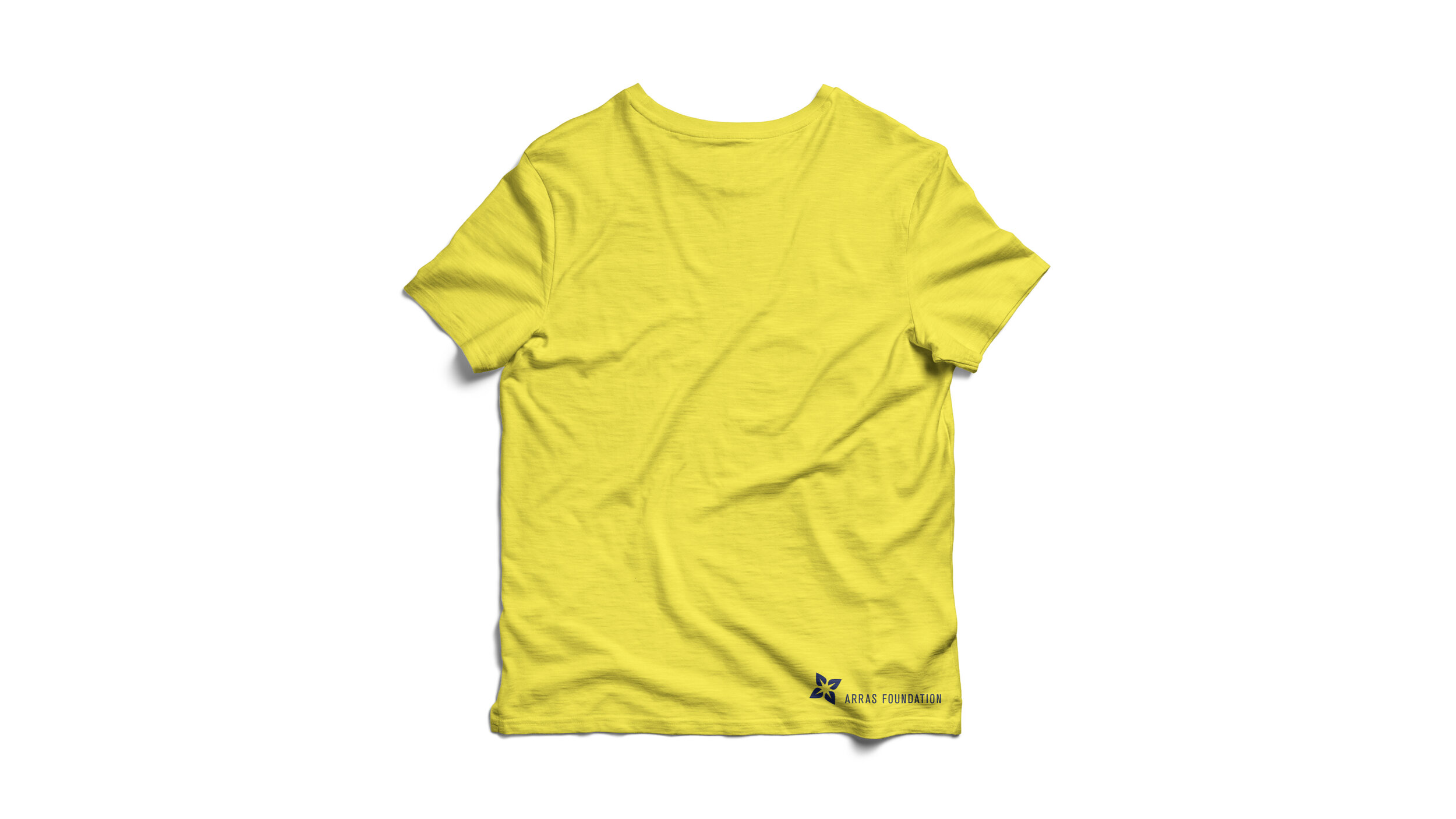
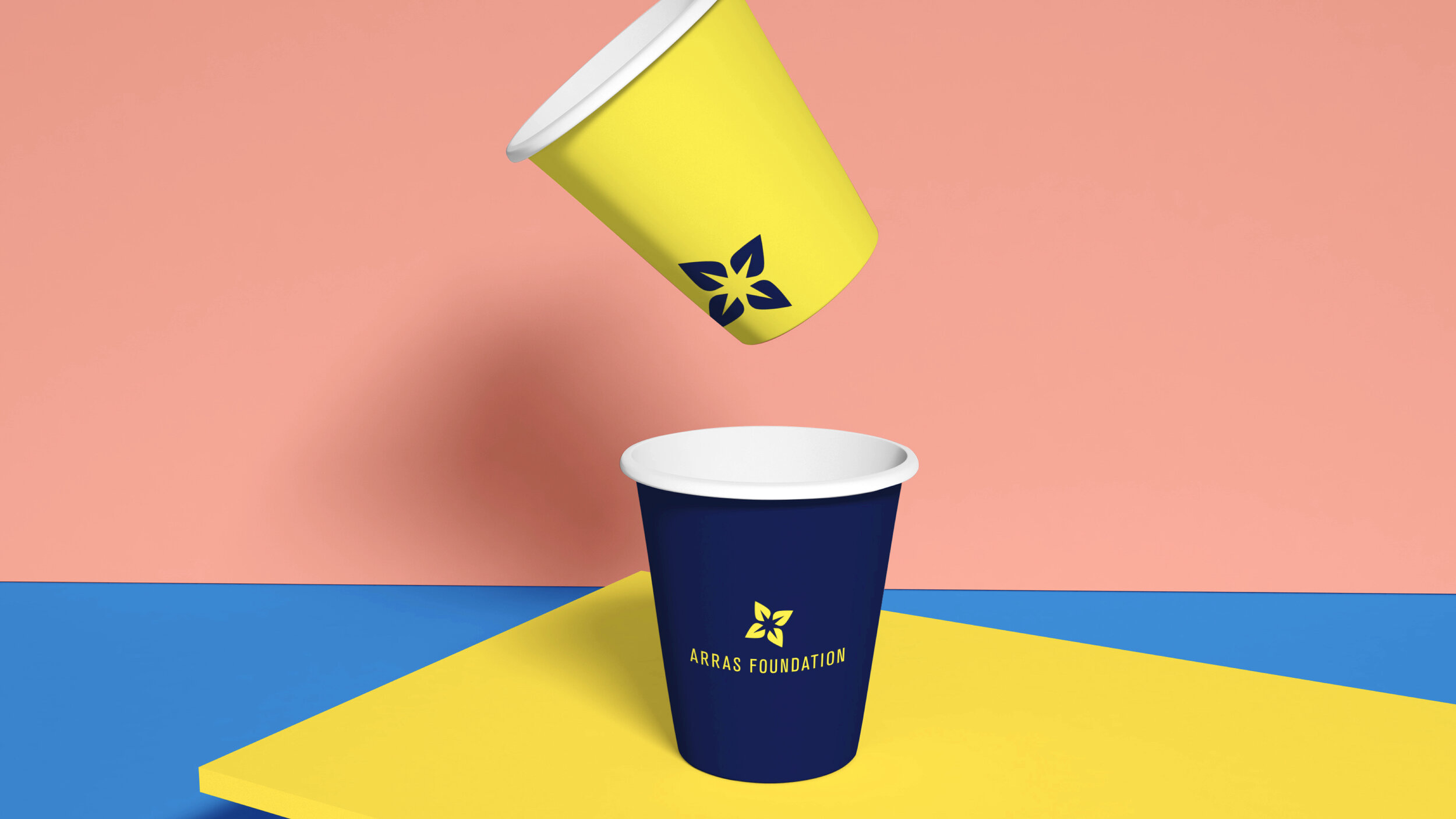
This is a rebranding project for the Arras Foundation, which was a real client that we had. The logo was designed based on their organization’s characteristics and beautiful environment of South California. It is composed of a flower shape in the positive space and a spark shape in the negative space. Both of them are very positive symbols, because their foundation always helps people. And it could be understood as lots of good meanings, beautiful environment, sunshine, light, hope, younger generations, help and even more. Different people can add different impressions to it from their own experiences.
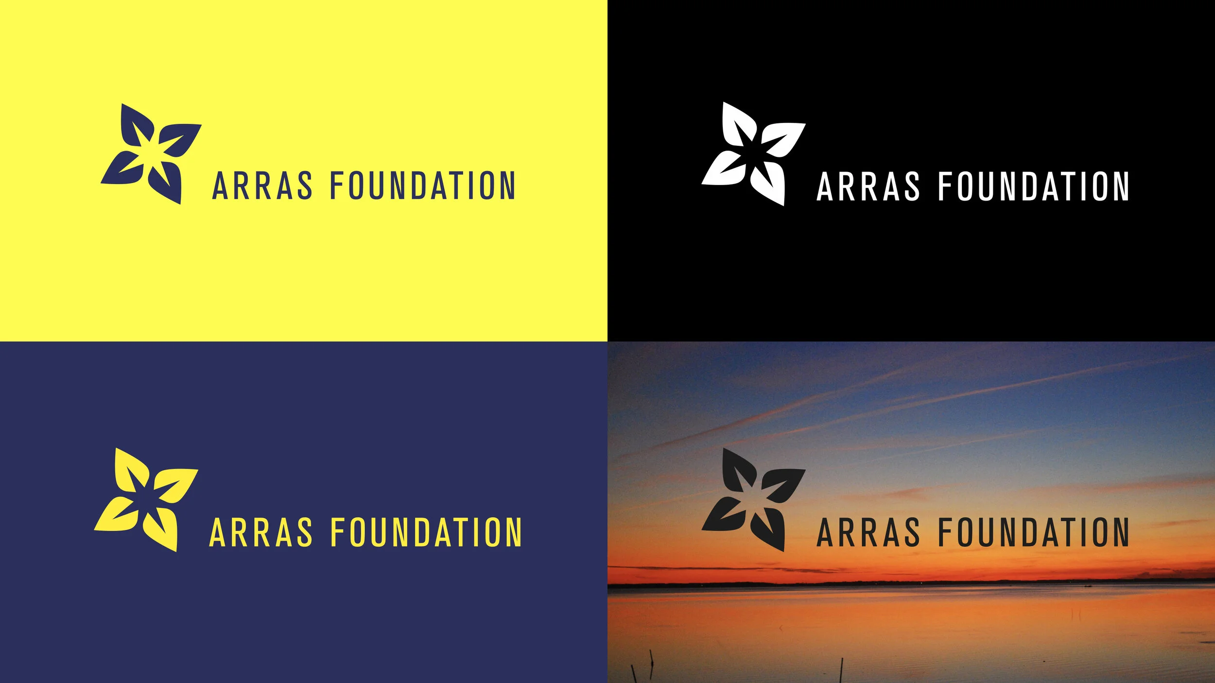
The typeface choice is Akzidenz-Grotesk, a san serif typeface, which was first released in 1989, around the era of J. Marion Sims, the foundation founder.
The color choice is from South Carolina’s State colors.

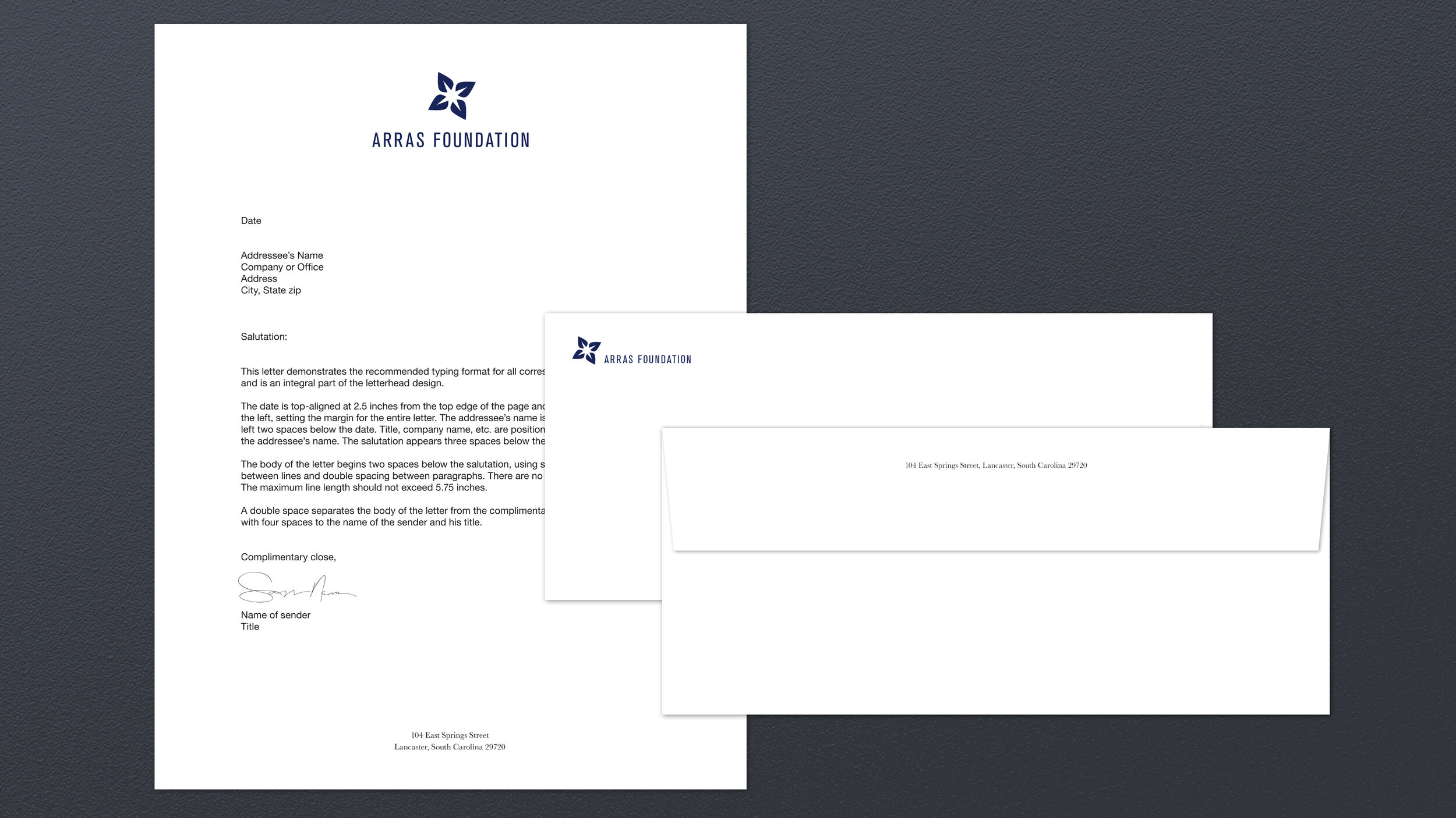
Baskerville is chosen as the supporting typeface. It is a serif typeface and has a great contrast with the logo type. It’s also a very humane typeface which fits the foundation and it has lots of weights. So it would be very easy to work with for the foundation.


